
Living Green
It isn’t earth day quite yet but here is something really interesting. This map makes it impossible to live green, well, live in the green at least. The color green represents places that have no population. It could be the site of a mall or business development because no one lives there or it could be a truly wild area where no one lives.
I love to look at maps and this map makes me happy because I see quite a bit of green left in the USA. Much of it is in Alaska which reminds me why I don’t want to visit there real soon. I fear if I go to Alaska to visit then I may never wish to return. In any case, I’m glad to live in an area surrounded by green both on the map and in real life.
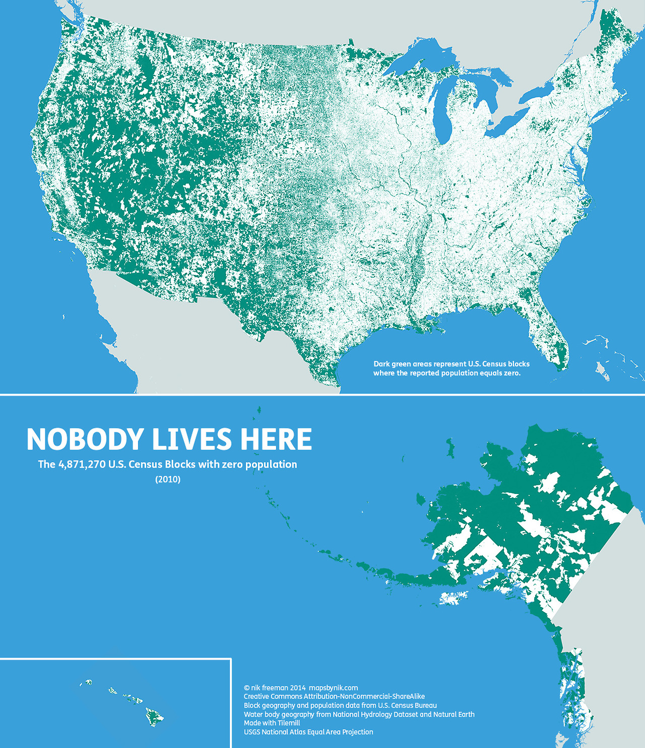
Nobody lives here: The nearly 5 million Census Blocks with zero population
A Block is the smallest area unit used by the U.S. Census Bureau for tabulating statistics. As of the 2010 census, the United States consists of 11,078,300 Census Blocks. Of them, 4,871,270 blocks totaling 4.61 million square kilometers were reported to have no population living inside them. Despite having a population of more than 310 million people, 47 percent of the USA remains unoccupied.
Green shading indicates unoccupied Census Blocks. A single inhabitant is enough to omit a block from shading
Quick update: If you’re the kind of map lover who cares about cartographic accuracy, check out the new version which fixes the Gulf of California. If you save this map for your own projects, please use this one instead.
Map observations
The map tends to highlight two types of areas:
- places where human habitation is physically restrictive or impossible, and
- places where human habitation is prohibited by social or legal convention.
Water features such lakes, rivers, swamps and floodplains are revealed as places where it is hard for people to live. In addition, the mountains and deserts of the West, with their hostility to human survival, remain largely void of permanent population.
Of the places where settlement is prohibited, the most apparent are wilderness protection and recreational areas (such as national and state parks) and military bases. At the national and regional scales, these places appear as large green tracts surrounded by otherwise populated countryside.
At the local level, city and county parks emerge in contrast to their developed urban and suburban surroundings. At this scale, even major roads such as highways and interstates stretch like ribbons across the landscape.
Commercial and industrial areas are also likely to be green on this map. The local shopping mall, an office park, a warehouse district or a factory may have their own Census Blocks. But if people don’t live there, they will be considered “uninhabited”. So it should be noted that just because a block is unoccupied, that does not mean it is undeveloped.
Perhaps the two most notable anomalies on the map occur in Maine and the Dakotas. Northern Maine is conspicuously uninhabited. Despite being one of the earliest regions in North America to be settled by Europeans, the population there remains so low that large portions of the state’s interior have yet to be politically organized.
In the Dakotas, the border between North and South appears to be unexpectedly stark. Geographic phenomena typically do not respect artificial human boundaries. Throughout the rest of the map, state lines are often difficult to distinguish. But in the Dakotas, northern South Dakota is quite distinct from southern North Dakota. This is especially surprising considering that the county-level population density on both sides of the border is about the same at less than 10 people per square mile.
Finally, the differences between the eastern and western halves of the contiguous 48 states are particularly stark to me. In the east, with its larger population, unpopulated places are more likely to stand out on the map. In the west, the opposite is true. There, population centers stand out against the wilderness.
Ultimately, I made this map to show a different side of the United States. Human geographers spend so much time thinking about where people are. I thought I might bring some new insight by showing where they are not, adding contrast and context to the typical displays of the country’s population geography.
I’m sure I’ve all but scratched the surface of insight available from examining this map. There’s a lot of data here. What trends and patterns do you see?
Errata
- The Gulf of California is missing from this version. I guess it got filled in while doing touch ups. Oops. There’s a link to a corrected map at the top of the post.
- Some islands may be missing if they were not a part of the waterbody data sets I used.
Leave a Reply
You must be logged in to post a comment.